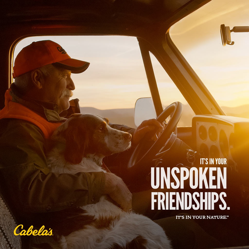
Cabela’s Ad

Contrast
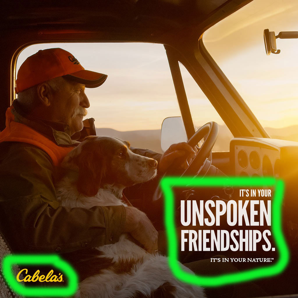
In this ad we can see the contrast of not only the yellow logo in the bottom left corner but the white text in the bottom right. they put these in the darker areas of the image to make them really stand out. Another form of contrast we can see here is the words “unspoken friendships.: this is to make that statement stand out from the other words.
Repetition
When we look at the Repetition in this ad we can see that in the use of color. It uses darker and warmer colors to promote a comforting feeling, just like the ad shows that its early in the morning or late in the evening. I feel a sense of comfort and a cozy sensation. others will pick up on that and have a feeling of peace.
Alignment
In this ad we see them focus on right alignment, as you can tell it is to not take the focus away from the image of the man and the dog to help enforce their statement of the relationship between the dog and his owner. the cabela’s logo in the bottom right shows the reader that this is what cabela’s is offering.
Proximity
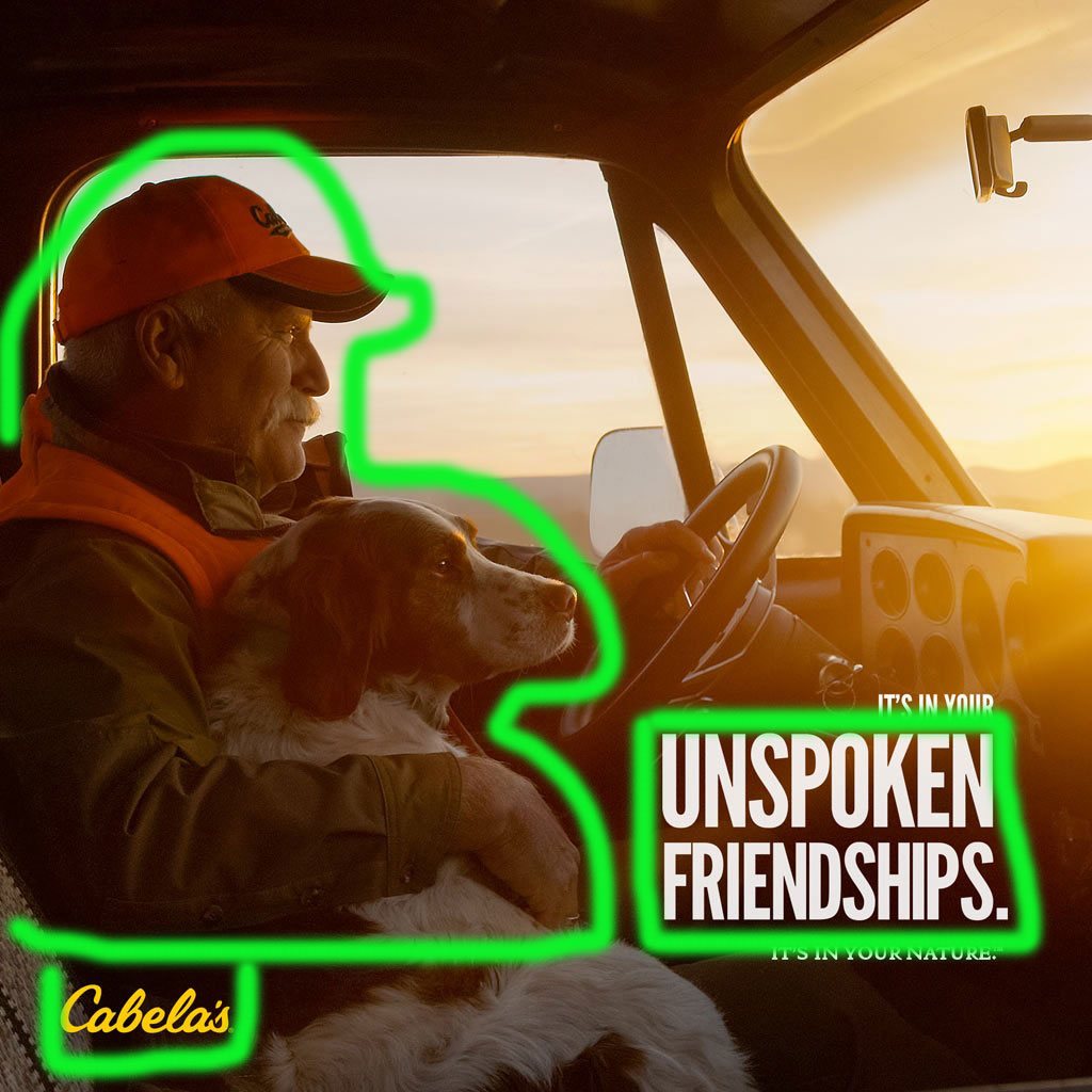
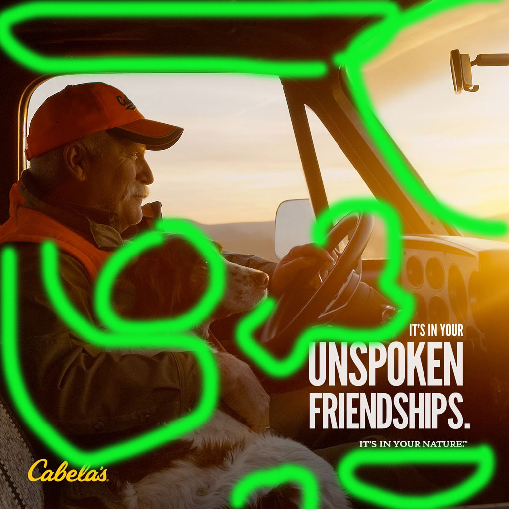
The proximity in this ad is well places with the giant unspoken friendship text and the cabela’s logo places around the man with his dog, this shows for one that cabela’s is all about these strong types of relationships to nature and animals and two they can relate to people of this lifestyle.
Color
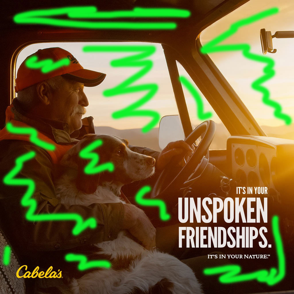
In the ad we see the use of warm colors used very well to give the audience as i have said before a warm and comfy feel to the ad. In my opinion they want to relate to the audiences longing for relationships and lasting memories in a positive way. they definitely portray their message of unspoken friendships with the use of warm colors in the ad.
Conclustion
In this Cabela’s Ad we see the principals of design. their use of color and proximity are by far the most powerful in this ad. This ad is easily relatable and the audience can feel like they are in the moment.
